
Within this research topic I have learned more effective ways to use this technique of white space in print media, this in turn has felt like the right thing to do but let the creative practice be the visual representation of this study. By making the book to present my research, it has allowed me to develop my understanding and use of white space and at the same time book design. As I am staying away from traditional dissertation binding and going to present this book in the design style I think will do the book justice.
My first thought was, like any eager designer, to start the design process straight away. But that approach was not the appropriate way to tackle this project. I would need to form a structure and do the necessary research into the topic. But throughout the research process, I was aware and selective on the literature and artefact pieces to use, so that upon writing about them I could envision the product and what way the work could be laid out to convey the message. Also with thinking ahead to the product and how it would be laid out, it made the decision on how to get it printed a lot easier, the information written about, needed a rough and modern look with it a new technique but it has been about for a while, just not known well enough to implement it throughout the design.
The first port of call was to find a topic of my interest, something that I would enjoy finding more about, possible changing my views on the topic or developing my understanding. So, after researching into graphic design sector I found my topic. This leading me to the library to study the books on this topic, and find websites and articles to deliver the message of how effective white space is in print media. Once the words were written it was my focus on what I believed was the correct look for the creative piece, as I want the readers experience to pleasant and wanting to read the book again. With my experience, already in this area it was my focus to make sure I delivered the correct look of great user experience appose to being no use to the user.
I started of researching the finish of the book before I started designing it, as I needed to know how the finished product would look, weight of pages, type of paper and how it was going to be bound together. After deciding on these specific areas of printing, I was never certain of the design when I was creating it, is this going to turn out right, what about the layout. The layout for the size of book was key, the information was limited and so to was the images used, as I wanted to have a sleek and minimalist look so that this showed of the knowledge I had gained from learning about white space.
From my knowledge and experience in book design, I started to feel that there was a certain way to design a finish this project, putting a load of pressure on to myself, which inevitably lead to a mind-set of limitations and no freedom to express the work that I wanted to present. It took several attempts to create the final piece that I have but I was once told never to delete work, keep the several copies of it, as one day it will come in handy with another piece of work. This was true with looking back over previous design work I found a piece of work that was limited to information and images, so developed this piece into my final creative book as the first few attempts never done the work research justice.
I had never worked this way before and I found it very fulfilling, as work that I have previously worked on was aiding me to complete a current project. It was not a waste of time designing that idea and keeping it in a folder, I feel now moving forward that I will be using this idea to aid more of my work, with being a creative there are several ideas developed before coming to a final piece, so there will be endless opportunities to use these ideas to make new final pieces as it will be the appropriate time to use them.
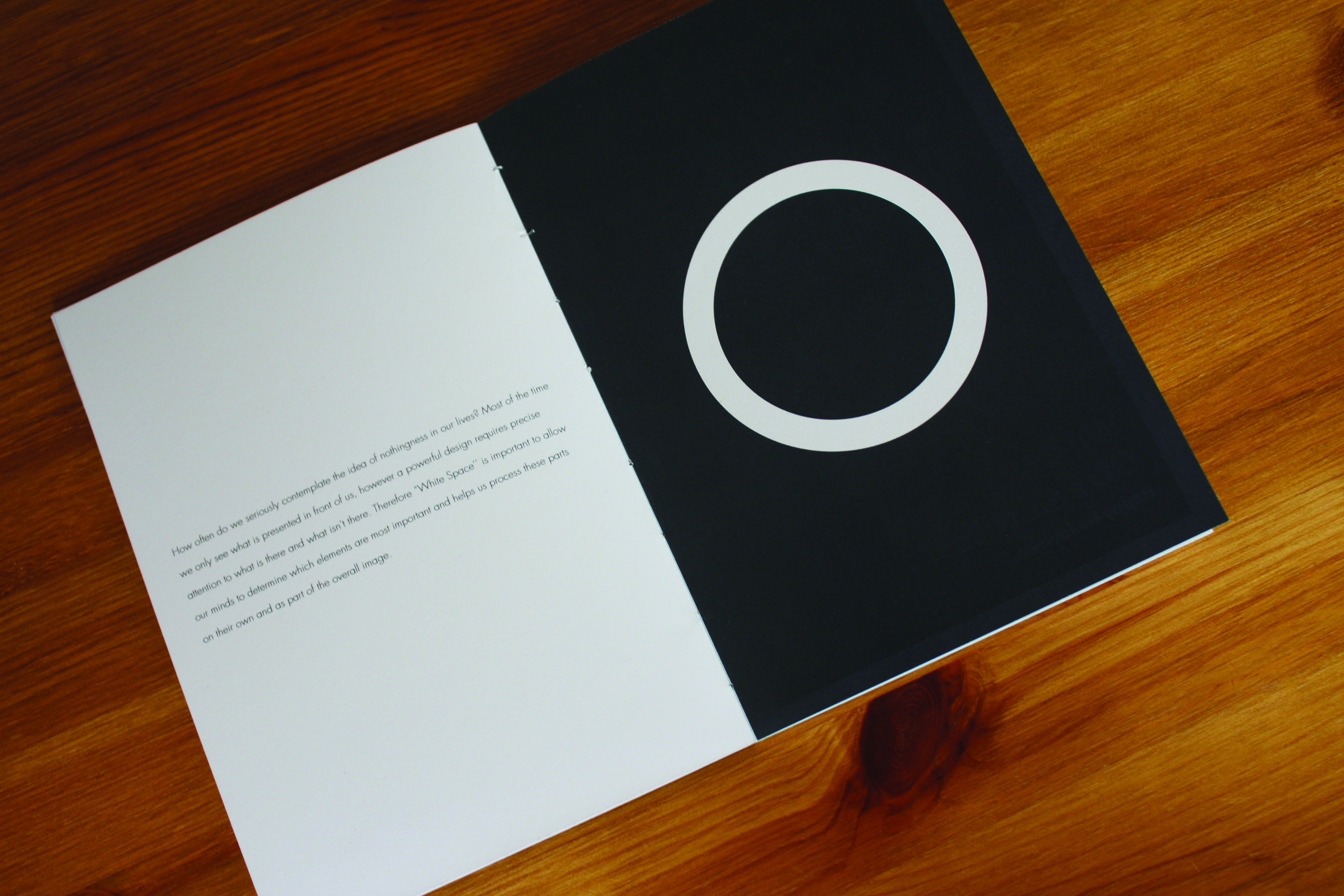
The design concept I am using is opened stitch bound book with a cover. The idea of the cover is to give it the modern look and opening to the open stitch will allow for the rough look to come across. Also, this sort of binding will add an extra detail in that shows I have thought about the whole process of this and with the book inside pages being white and having the stitching black. This will be another highlighted area of effective use of white space with in print media, and it will look good for the user.
To express the right message as all designer are trying to do with the use of white space being implemented well. By taking this consideration on board and using it alongside the way I am going to be binding the finished book, it shows that I have learned from this research topic and can now deliver a stronger message to the user.
On to the design process of the creative piece, this seemed like it was going to be easy to create. As this is something I was familiar with doing, thinking to myself, what was hard in creating a book with my research in it and showing off my knowledge. But in turn it wasn’t as easy, turned out to be more difficult than I thought. I was struggling with the process of the getting a strong spread together and presenting the work well. With the text being a few hundred words it just looked lost on the page, especially when there was not any other information to be placed on the page. The individual spreads had to work in unison with each other but at the same time can stand on there on as they voiced a different view on the same topic. I believe that I was making it more difficult for myself, thinking that it should be more detailed and look something more than what it can be with the style I wanted. Looking back the I know that I didn’t have to be like that with myself as the work was needing this simplistic look and works well being a limited colour palette as well.
The colour palette was something of a personal choice than researching a selected palette. But these colours I feel are appropriate in fitting with the project as the two colours harmonise together on the page and are not bold bright colours neither dark cold colours. These colours allow for the quotes to be shown around the spread visually without standing out and affecting the user experience.
With using the same typeface and sized throughout it implements a standard across the book and I believe this works the best with previous projects. It allows the user to be accustomed to the style and will be able to follow the research and not think that it was all separate pieces. With the body of text, I was looking for a very linear, structured look but with having the text justified it would look good at first glance but on reading the text there would be a large amount of kerning so the text reached the edge of the text box. This looks to me as it is missing words or has not been thought out properly so I chose the left-aligned body of texted. This is staying away from the common use of the justified text that has been used in book design with minimal text. In doing so I was able the have the text structured and giving off a better linear look than the justified body text.
With the pages being alternated with text first then the images first, this was after researching into smart book design. Whilst looking through lots of examples it was clear that alternative pages worked more appropriately with the minimalist look rather than following the same spread layout on all the pages. Overall looking back this was the correct choice as it allows the user to be not feeling as it was a repetitive job creating it and it lets them get involved in the book. The difference also allows the design to be more creative and unique rather than running out of ideas to lay out the page.
With the white space being used so vividly in my design it will then strengthen my opinion and findings that white space is key. This in turn allowed my creative book to have the sense of sophistication and elegance, as I have placed every part of this book to an exact place that I want it to be. Allowing me to deliver a stronger more meaningful piece that the user will enjoy reading and understand the context within the book.
Overall I think the creative piece for my dissertation worked well with my findings within my research and I believe the finish of the book also helped to support my reason that white space is effective in print media. There are a lot of different views surrounding this topic but with what I have found in my research and personally, implemented well this technique alone can make a large impact on your design. It helps in some many different aspects of design that you from a glance will not take on board but once you study the piece you will start to understand.
White space, both unclutters design and helps mould and draw focus to the content on the page. To recap, we can also improve white space usage by analyzing and refining margins by keeping them consistent in most circumstances, and paying attention to typography and micro-level spacing. Ideally, we should also take each project differently to recognise the ideal spot in the design. Aside from the practical benefits of a clean, uncluttered print media, white space can create a sense of sophistication and elegance by allowing the content to “speak for itself” without major intrusions that appear cheap or cluttered.
Inevitable there is things I would change within my project; I am a designer and I will critically analyse my work all the time and feel that it could be better. But there are deadlines and that must be met, so all you can do is your best at that current time. I feel the design layout could have been stronger and more creative, I kept trying to make it different to what I had come up with but it was not looking as strong as the minimalist look I wanted. But I believe this outcome to my research project, answers the entire questions that are asked. It delivers the message I set out to make, that white space is effective in print media, if implemented in the appropriate form.
Recent Comments